shadcn/ui: The UI Library That Makes Ant Design Look Like MySpace (115k+ Stars!) 🎨
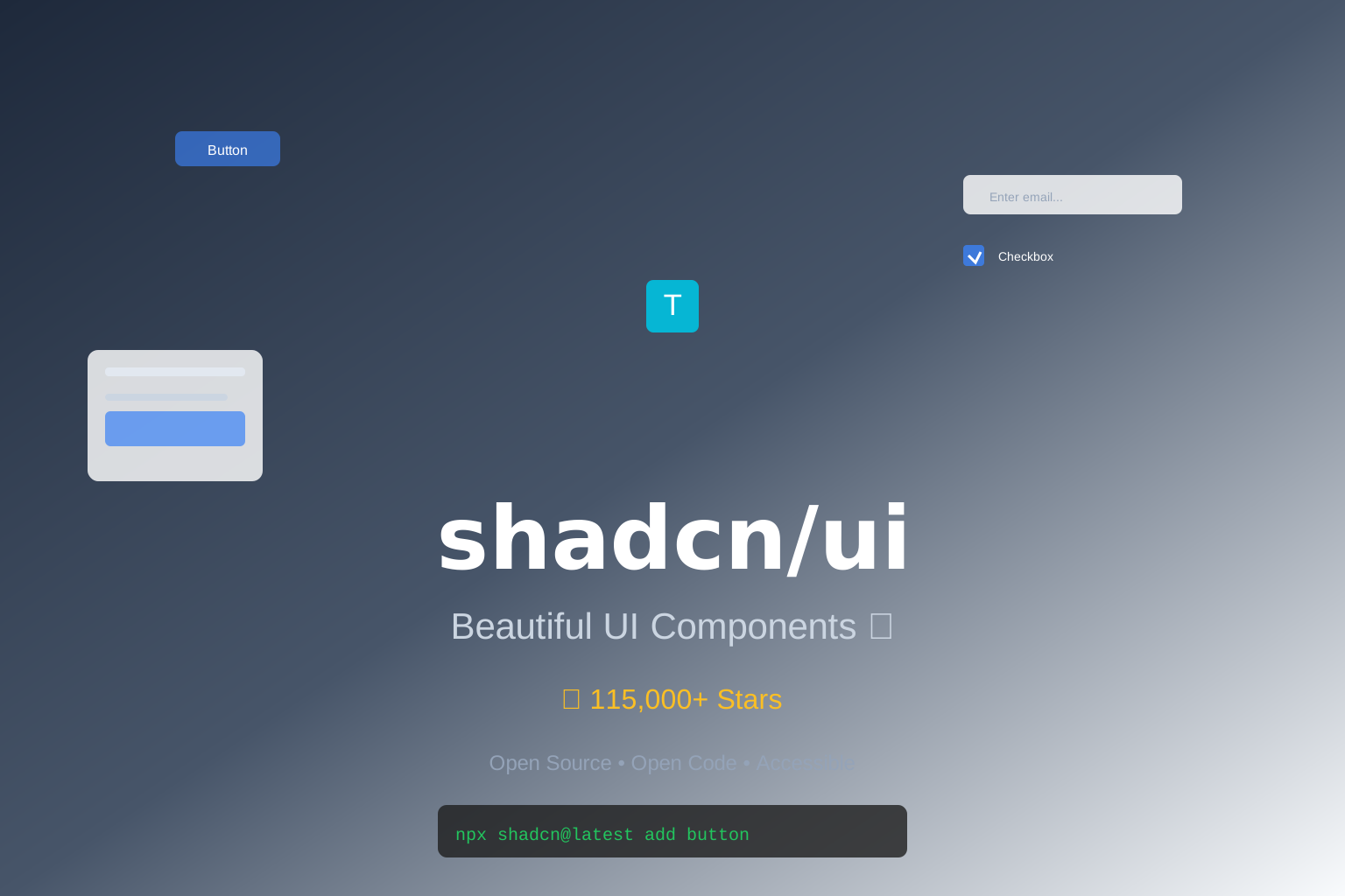
(Yeah, that’s a UI library… but NOT the kind you’re used to! 🎨)
🤔 So, You’re Still Using Ant Design?
Look, I’m not gonna bash Ant Design. It’s like that IKEA furniture you bought in college — it looks okay, but god damn it’s bloated. 🪑
I mean, it’s 2026. We’ve got:
- 🎨 Design systems that don’t look like 2010 SharePoint
- 🤖 AI models that generate components for us
- ⚡ Tailwind CSS (goodbye, 500-line CSS files!)
And you’re still using a UI library that adds 2MB to your bundle?
Bruh. 💀
🎨 What the Hell is shadcn/ui?
shadcn/ui isn’t just a UI library. It’s a code distribution platform that gives you beautifully-designed, accessible components… but with a TWIST.
The twist? It doesn’t install as a traditional npm package. It copies the SOURCE CODE into your project.
It’s like buying a pizza 🍕 where they give you the recipe and ingredients instead of a frozen pizza. You can customize EVERYTHING.
Key facts that’ll make you go “HOLY SHIT”:
- 🌟 115,000+ GitHub stars (and growing FAST!)
- 🎨 Beautifully-designed components (actually looks good, unlike Bootstrap)
- ♿ Accessible by default (WAI-ARIA compliant, no extra work)
- 🎨 Built on Tailwind CSS + Radix UI (the dream team)
- 🤖 Works with AI models (generate components with AI!)
- 🔓 Open Code model (NOT a black-box npm package!)
- 🎨 Fully customizable (change ANYTHING, because you own the code)
- 🆓 MIT license (free for commercial use)
Basically, it’s like having a designer + frontend dev sitting in your project… except it doesn’t complain about your code style or steal your lunch from the office fridge. 🍕
🤯 Why It’s Breaking the Internet
Okay, so why is everyone and their dog talking about shadcn/ui? Let me break it down:
1️⃣ It’s NOT a Traditional UI Library
This is the BIGGEST difference.
Traditional UI libraries (Ant Design, MUI, Chakra, etc.):
- ✅ Easy to install:
npm install antd - ❌ Black box: You can’t change the internals
- ❌ Hard to customize: Overriding styles is a NIGHTMARE
- ❌ Bloaded: Adds 500KB-2MB to your bundle
- ❌ Version lock: Upgrading breaks your custom styles
shadcn/ui:
- ✅ Install by copying source code into your project
- ✅ You own the code: Change ANYTHING you want!
- ✅ Easy to customize: It’s just Tailwind CSS classes!
- ✅ Zero bloat: Only include what you use
- ✅ No version lock: It’s YOUR code, upgrade whenever!
Here’s how it works:
1 | # Step 1: Initialize shadcn/ui in your project |
After running this:
- ✅ The FULL source code for
Button,Card,Dialogis in your project (components/ui/) - ✅ You can edit the code however you want!
- ✅ No npm package dependency (it’s YOUR code now!)
MIND = BLOWN. 🤯
2️⃣ It’s Actually Beautiful 🎨
Let’s be real — most UI libraries look like shit.
- Bootstrap: Looks like 2010
- Ant Design: Looks like enterprise software from 2015
- MUI: Looks like Material Design had a stroke
shadcn/ui looks like a designer actually cared.
It uses:
- ✅ Tailwind CSS for styling (utility-first, easy to customize)
- ✅ Radix UI for accessibility (WAI-ARIA compliant)
- ✅ Clean, modern design (think: Vercel, Stripe, Linear)
Your app will look like a premium SaaS product, not a MySpace page from 2005. 💀
3️⃣ Works with AI Models 🤖
This is the craziest part.
shadcn/ui is designed to work with AI. You can:
- ✅ Use AI to generate components based on shadcn/ui
- ✅ Use AI to customize components (ask AI to change colors, layout, etc.)
- ✅ Use AI to build new components that match shadcn/ui’s style
Example:
1 | # You type (in plain English): |
It’s like having a frontend dev who never gets tired and works for free. 💸
4️⃣ Accessible by Default ♿
Accessibility (a11y) is usually an afterthought.
You build your app, then realize: “Oh shit, screen readers can’t read my dialog.” 💀
shadcn/ui components are accessible BY DEFAULT:
- ✅ WAI-ARIA compliant (follows accessibility standards)
- ✅ Keyboard navigation (tab through elements, escape to close dialogs)
- ✅ Screen reader support (aria labels, roles, etc.)
- ✅ Focus management (focus trap in dialogs, focus restore after close)
You don’t have to do ANYTHING. It’s accessible out of the box.
Your lawyer will thank you when you don’t get sued for ADA non-compliance. ⚖️
🛠️ How to Install This Bad Boy
Alright, I’ve convinced you. You want shadcn/ui. Here’s how to get it:
Option 1: Quick Start (Easiest)
1 | # For Next.js project |
Boom! Components are now in components/ui/! 🎉
Option 2: Manual Installation (For the 10x Developers)
1 | # Step 1: Install dependencies |
Pro tip: Just use npx shadcn@latest add. It’s easier. 😎
💡 Real-World Use Cases (aka “When Would I Actually Use This?”)
Okay, enough hype. Let’s talk about real shit you can do with shadcn/ui.
Use Case 1: Building a SaaS Dashboard 📊
You need to build a dashboard for your SaaS product. You want it to look like Stripe or Vercel (clean, modern, premium).
With Ant Design:
1 | // Ugly AF, hard to customize |
With shadcn/ui:
1 | // Beautiful, fully customizable |
Result: Your dashboard looks like a $10,000 custom design. 💰
Use Case 2: Customizing Components (Because Your Designer is Picky) 🎨
Your designer says: “I want the button to have rounded corners, gradient background, and a shadow.”
With MUI:
1 | // Good luck overriding 500 lines of MUI styles |
With shadcn/ui:
1 | // Just edit the source code! It's YOURS! |
DONE. No fighting with CSS specificity. No !important. Just edit the code.
It’s like the component is YOURS… because it IS. 💪
Use Case 3: Building a Design System for Your Team 👥
You’re leading a team of 10 developers. You want consistent UI across all projects.
Traditional approach:
- Build a private npm package with your components
- Publish it to private npm registry
- Team installs it:
npm install @your-company/ui - Problem: Team can’t customize the components! They’re black boxes!
With shadcn/ui:
- Create a shared repo with your customized shadcn/ui components
- Team copies the source code into their projects
- Team can customize as needed (because they own the code!)
It’s the BEST of both worlds:
- ✅ Consistency: Everyone starts with the same base components
- ✅ Flexibility: Teams can customize as needed
- ✅ No version lock: No more “upgrading the UI library broke my app”!
Use Case 4: Rapid Prototyping with AI 🤖
You have an idea for a startup. You want to prototype fast.
With shadcn/ui + AI:
1 | # You type: |
Boom! Landing page built in 10 minutes.
Go to your investors and say: “Look at our MVP!” (even though it’s just a landing page 🤫).
🥊 shadcn/ui vs The World (Spoiler: shadcn/ui Wins)
Let’s be real — there are a LOT of UI libraries out there. How does shadcn/ui compare?
| Feature | shadcn/ui | Ant Design | MUI | Chakra UI | Radix UI |
|---|---|---|---|---|---|
| Open Code Model | ✅ Yes (copy source) | ❌ No (npm package) | ❌ No | ❌ No | ⚠️ Partial |
| Customizability | 💯 Full (you own code) | 📝 Hard | 📝 Hard | ⚠️ Medium | ✅ High |
| Bundle Size | 🪶 Zero (your code) | 📦 ~2MB | 📦 ~1MB | 📦 ~500KB | 🪶 Small |
| Accessibility | ♿ Full (WAI-ARIA) | ♿ Partial | ♿ Partial | ♿ Good | ♿ Full |
| Design Quality | 🎨 Beautiful | 🎨 Okay | 🎨 Good | 🎨 Good | 🎨 Minimal |
| AI-Friendly | ✅ Yes | ❌ No | ❌ No | ⚠️ Partial | ⚠️ Partial |
| Learning Curve | 📚 Medium | 📚 High | 📚 High | 📚 Low | 📚 Medium |
| Community | 🌟 115k+ stars | 🌟 92k stars | 🌟 94k stars | 🌟 38k stars | 🌟 34k stars |
The verdict:
- Ant Design is great for enterprise apps (if you don’t care about bundle size or customization)
- MUI is great for Material Design fans (if you don’t mind fighting with styles)
- Chakra UI is great for rapid prototyping (but limited customization)
- shadcn/ui is the BEST for modern web apps that need beautiful design + full customization.
If you want beauty + flexibility + accessibility, shadcn/ui is the clear winner. 🏆
🚀 Hands-On: Building a SaaS Landing Page with shadcn/ui
Alright, enough theory. Let’s build something real with shadcn/ui!
We’re gonna build a SaaS landing page with:
- 🎨 Hero section (headline, subtitle, CTA button)
- 🎨 Features section (3 feature cards)
- 🎨 Pricing section (3 pricing tiers)
- 🎨 Footer (links, copyright)
And we’ll use shadcn/ui components + Tailwind CSS!
Step 1: Set Up the Project
1 | # Create a new Next.js project |
Boom! Project created. 🎉
Step 2: Build the Hero Section
1 | // app/page.tsx |
DONE! Hero section built in 30 lines of code.
No CSS files. No style objects. Just Tailwind CSS classes + shadcn/ui components. ✨
Step 3: Build the Features Section
1 | // app/page.tsx (add below hero) |
Boom! Features section with 3 cards in 20 lines of code.
Try doing that with Ant Design. You’ll be fighting with Col, Row, and Gutter props for hours. 💀
Step 4: Customize the Theme
Want to change the primary color? Or the border radius? Or the font?
Just edit tailwind.config.js and globals.css!
1 | // tailwind.config.js |
1 | /* app/globals.css */ |
DONE! Your entire app’s theme is now indigo-colored with rounded corners.
No recompiling node_modules. No fighting with CSS specificity. Just change the config. 🎨
📚 Want to Learn More?
shadcn/ui is HUGE. We’ve only scratched the surface. Here are some resources to level up your shadcn/ui game:
📖 Official Docs
- Website: ui.shadcn.com
- Documentation: ui.shadcn.com/docs
- GitHub Repo: github.com/shadcn-ui/ui (115k+ ⭐)
- Examples: ui.shadcn.com/examples
🎥 Video Tutorials
- shadcn/ui Crash Course: Search on YouTube (tons of tutorials!)
- Building with shadcn/ui + Next.js: Check Vercel’s YouTube channel
- shadcn/ui + AI: Search “shadcn ui ai generate components”
🛠️ Community
- Discord: discord.gg/shadcn-ui (community server)
- Twitter: @shadcn (for updates)
- Reddit: reddit.com/r/shadcn (community)
📝 Tutorials
- shadcn/ui Complete Guide: designrevision.com/blog/shadcn-ui-guide
- shadcn/ui + Tailwind CSS: Search on Dev.to
- Building a SaaS with shadcn/ui: Search on YouTube
🆓 Free Stuff!
- shadcn/ui is FREE (MIT license, free for commercial use)
- shadcn/ui has TONS of free components (button, card, dialog, dropdown, table, form, etc.)
- shadcn/ui website has a FREE block library (pre-built sections like hero, features, pricing, etc.)
🎯 Final Verdict: Should You Switch?
Look, I’m not gonna tell you what to do. (Okay, maybe I will. 😇)
If you’re a developer who:
- ✅ Wants to save time on UI development
- ✅ Likes the idea of owning your component code
- ✅ Wants beautiful design (without hiring a designer)
- ✅ Loves Tailwind CSS (and hates CSS files)
- ✅ Cares about accessibility (or doesn’t want to get sued ⚖️)
Then YES, switch to shadcn/ui. It’ll change your workflow. It changed mine.
If you’re a developer who:
- ❌ Likes fighting with CSS specificity (you masochist 🤨)
- ❌ Thinks Ant Design is “good enough” (your users disagree)
- ❌ Doesn’t care about bundle size (2MB is fine, right? 💀)
- ❌ Is happy with MySpace-era design (it’s 2026, wake up!)
Then stick with what you have. But don’t say I didn’t warn you when your competitor’s app looks 10x better with shadcn/ui. 😎
💬 Discussion: What Do You Think?
Have you tried shadcn/ui? Are you gonna switch from Ant Design? Or are you gonna wait until “everyone else is doing it”?
Drop a comment below! Let’s argue about UI libraries like the nerds we are. 🤓
P.S. If you’re still using Bootstrap in 2026… please get help. 🙏
P.P.S. If this article helped you, smash that star button on GitHub! ⭐ And if it didn’t… well, shadcn (the creator) wrote most of the library, so don’t blame me! 😂
Happy coding, and may your UIs be ever beautiful! 🎨
(Disclaimer: No UI libraries were harmed in the making of this article. Except maybe Ant Design’s feelings. Sorry, Ant Design.) 💔
🎁 Bonus: shadcn is Indonesian! 🇮🇩
Did you know? shadcn (the creator) is Indonesian!
His real name is Zain Fathoni (aka “shadcn”).
He created shadcn/ui as a side project… and it blew up to 115,000+ stars!
Other cool Indonesian tech:
- 🎨 shadcn/ui (the hottest UI library right now!)
- 🗾 Tailwind CSS (created by Adam Wathan, but lots of Indonesian contributors!)
- 🗾 Next.js (created by Vercel, but lots of Indonesian contributors!)
Check out Zain’s Twitter: @shadcn
He’s a legend! 🇮🇩🙇